Rob Sudars Works
CPG Brand Design Director
Visual Identity & Packaging Leader
Nestlé

Nesquik Redesign
The Nesquik redesign modernized the brand for a new generation while preserving its playful spirit. Simplification became the key to redefining the brand and sharpening its ownable assets. For the ready-to-drink portfolio, we created a more confident expression for a young adult go-getter. For the classic powder mix, we updated Quiky for younger consumers while reassuring parents that the brand still delivered the familiar taste and family appeal they expected. The result was one cohesive Nesquik visual world that could speak clearly to two distinct audiences.
Project includes brand architecture, packaging, visual identity, illustration, and brand guidelines.


Morsels & More Product Line
Morsels & More expanded Nestlé Toll House beyond morsels and cookies with a new product line that mixed classic morsels with playful baking inclusions such as mini marshmallows, nuts, and crunchy bits. Consumers could bake them into cookies, muffins, and brownies or enjoy them straight from the bag. The packaging needed to appeal to moms at shelf with quality, ease, and versatility, while creating a fun, colorful expression that all could connect with on the kitchen counter. The result was an abundant visual system that could flex across everyday and seasonal offerings.
Project includes brand architecture, packaging, visual identity, photography, social, illustration and ecommerce.


Nestlé Toll House Seasonal Redesign
The seasonal ready-to-bake portfolio needed a design system that worked at both the shelf and the kitchen counter. The redesign appealed to moms at shelf through quality, ease, and trusted Nestlé Toll House cues, while delivering the fun, flavor, and seasonal excitement kids look for once the package is at home. The resulting system flexed across rotating holiday and seasonal lineups throughout the year.
Project includes brand architecture, packaging, branding, illustration, photography, social, and ecommerce.


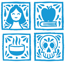
Nestlé El Mejor Nido Website Redesign
El Mejor Nido's redesign centered on Nestlé's online Latinx food and family destination with the goal of building a stronger bilingual community around recipes, culture, and everyday family life. The new identity system celebrated a modern multilingual consumer while honoring the site's heritage recipe platform. To improve clarity and navigation, we developed a visual language of pictograms inspired by traditional Mexican tiles, bringing more warmth, utility, and cultural character to the experience.
Project includes visual identity, brand design system, illustration, and brand guidelines.

© 2026 by Rob Sudars